What Is It
An in-depth editorial project breaking down the typography behind the Marvel Loki series logo. Each letter in “Loki” uses a completely different typeface — a masterclass in typographic eclecticism.
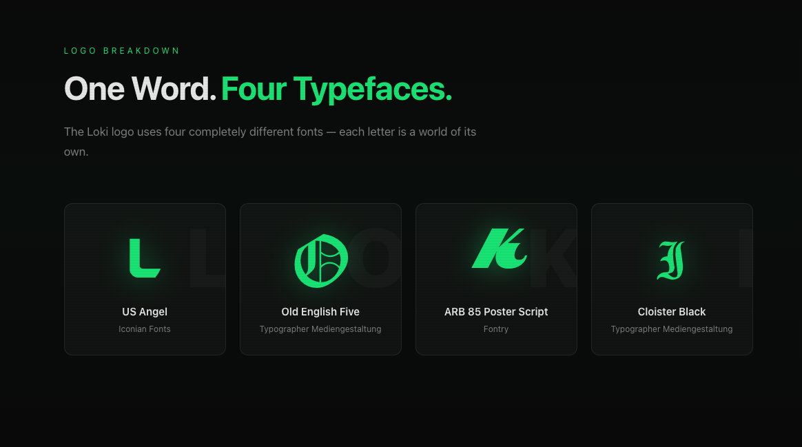
The Four Fonts
| Letter | Font | Foundry |
|---|---|---|
| L | US Angel | Iconian Fonts |
| O | Old English Five | Typographer Mediengestaltung |
| K | ARB 85 Poster Script JAN-39 | Fontry |
| I | Cloister Black | Typographer Mediengestaltung |
Why It Works
The logo is a visual representation of Loki himself — the God of Mischief. Each letter is a different identity, a different face, stitched together into one deceptive whole. Sharp angular serifs (L), Norse blackletter (O), theatrical retro script (K), and solemn gravitas (I).
Features
- Full character previews for all four typefaces
- License information for each font
- Download links to free versions
- Context — how the logo fits into the MCU branding
- SEO-optimized — answers the #1 question about the Loki logo
Tech Stack
- Astro — static site generation
- Tailwind CSS — styling
- Markdown content — easy to update and maintain
Links
- Live site: loki.allbestfonts.com
- Source code: github.com/temaprint/Loki-Font